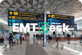
EMTDesk
Brand Guidelines
Your comprehensive guide to maintaining brand consistency
Logo Anatomy
Wordmark Construction
The wordmark combines "EMT" in white/dark and "Desk" with the distinctive "D" highlighted in our signature green (#1ED9A5). This creates visual hierarchy and brand recognition.
Clear Space
Maintain minimum clear space equivalent to the height of the letter "D" on all sides of the logo. This ensures the logo always has room to breathe.
Always maintain adequate clear space around the logo. Never crowd it with other elements or text.
Never stretch, squash, or distort the logo. Always maintain proper proportions when scaling.

Avoid placing the logo on busy, colorful, or low-contrast backgrounds that reduce legibility.
Use the white/green logo version on dark backgrounds for optimal contrast and visibility.
Use the dark/green logo version on light or white backgrounds for maximum readability.
Never display the logo smaller than 120px width for digital or 1 inch for print to ensure legibility.
Our signature color. Use for CTAs, accents, and brand moments. Represents innovation and trust.
Primary dark tone for backgrounds, headers, and premium feel. Conveys professionalism and stability.
Light background for cards, sections, and subtle contrast. Creates breathing room and hierarchy.
Supporting accent for secondary information, borders, and subtle emphasis. Balances the palette.
Soft accent for backgrounds, highlights, and gentle visual separation. Creates calm, approachable spaces.
Primary background for clean, professional layouts. Essential for clarity and content focus.
Color Application Guidelines
- Use EMTDesk Green for CTAs and key actions
- Maintain 4.5:1 contrast ratio for accessibility
- Use Dark Navy for premium, professional contexts
- Apply neutrals generously for balance
- Use EMTDesk Green for CTAs and key actions
- Maintain 4.5:1 contrast ratio for accessibility
- Use Dark Navy for premium, professional contexts
- Apply neutrals generously for balance
Photography Style
Use authentic, natural photography that shows real business travelers in genuine moments. Avoid overly posed or stock-looking images. Prioritize diversity, professionalism, and approachability.
Visual Composition
Images should have clean composition with ample negative space. Use shallow depth of field to create focus. Lighting should be natural and warm, avoiding harsh shadows or over-saturation.
Subject Matter
Focus on business travel scenarios: airports, hotels, meetings, transportation, and workspace environments. Show technology integration and seamless experiences. Capture moments of efficiency and satisfaction.
Image Treatment
Apply subtle green color overlays (10-15% opacity) to create brand consistency. Maintain high contrast and clarity. Use rounded corners (12-16px) for a modern, friendly feel. Avoid heavy filters or artificial effects.
Our Brand Voice
- Professional yet approachable – We're experts who speak in plain language
- Confident and reassuring – We solve problems with certainty
- Efficient and clear – We respect your time and intelligence
- Human and empathetic – We understand business travel challenges
Writing Guidelines
- Be direct – Start with the most important information
- Use active voice – "We simplify travel" not "Travel is simplified"
- Avoid jargon – Explain complex features in simple terms
- Show don't tell – Use specific examples over vague claims
EMTDesk Brand Guidelines – Version 1.0 – February 2026