We use Poppins and Inter fonts. Poppins are geometric in style, clean, and include 18 different font weights, from thin to black. Meanwhile, inter is san-serif typeface that’s ideally used for making both body text and headings. It includes various weights, allowing users to make flexible typographic choices. These fonts are great for improving readability and style of the content.
Poppins is good to use if your style is: Playful, Modern, Natural, Professional
Inter is good to use if your style is: Inclusive, Minimalist, Cheerful, FriendlyOur brand communications use these weights:
Create images or vector artwork, including logos.
Create a Web Project.
Use font to create in-house or commercial video content.
Use these font for Print Material and document for viewing and printing.
- Headlines need to be in sentence case & do not use end punctuation.
- Subheads need to be in sentence case & use end punctuation.
- CTAs need to be in sentence case & do not use end punctuation.
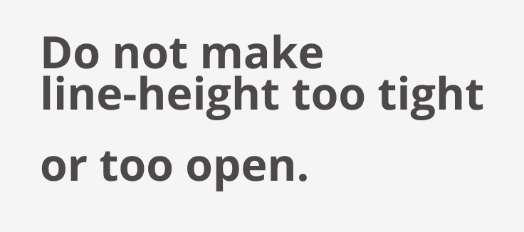
- Avoid widows & orphans, if possible.
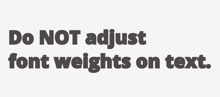
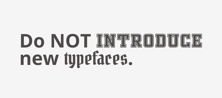
The following best practices apply to all our brand communications (video, print, digital, & social).